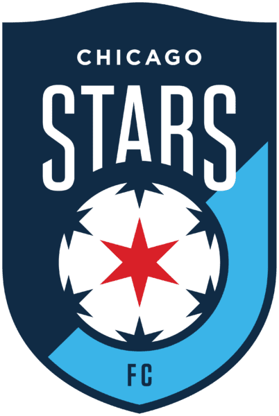
Courtesy: Chicago Stars FC
NWSL side rebrands to reintroduce themselves to Chicago.
CHICAGO, IL–Much like Chicago Fire FC rebranded in 2019 (and again in 2021), the Chicago Red Stars announced a rebrand of their identity to reintroduce themselves to Chicago (and maybe play within its city limits in the future) and to demonstrate the club’s commitment to representing and connecting Chicago’s diverse neighborhoods. The team will now be known as Chicago Stars FC with a new crest, but the same colors as before.
The team’s shield now features a solitary star similar to that on the flag of the City of Chicago, plus subtle symbols such as the curved shape at the top of the crest that is meant to resemble the marquees found across the city such as that of the Chicago Theatre and of Wrigley Field (home the Chicago Cubs owned by Laura Ricketts’s family and where the Red Stars played a home match this season). The blues that fill the crest also hold represent “the adjoining of the “Night Sky” and “Great Lake” blues symbolize the meeting between the land and lake” according to the press release.
“As the stewards of this club, Laura Ricketts, the ownership group and the leadership team believe it is time to evolve our identity as a symbol of this new chapter,” said Karen Leetzow, Chicago Stars FC president. “It is our intent going forward to honor the legacy made by past players, fans and associates, while carving a new path for the club and representing Chicago more authentically on and off the pitch.”
New apparel with new logo will be exclusively available on the Stars’ online shop and for the regular season finale on November 3rd at SeatGeek Stadium against Kansas City Current.
For the remainder of the 2024 season, the club will continue to use the ‘Red Stars’ name and logo before transitioning to the new ‘Stars’ moniker and logo for 2025.
![Prost International [PINT]](https://prostinternational.com/wp-content/uploads/2021/08/PINTtFontLogoRoboto1536x78.jpg)


